Threading the Needle of Our Rebrand
A rebrand is a heavy lift, even for professional branders. You have to be ready to navigate a modest cosmos of decisions, interpretations, desires and impressions. There are insights to evaluate, strategies to calculate and aesthetics to calibrate. At Superhuman, our approach was playful and experimental. We tried on new ideas like costumes, mixing and matching to build toward a logic that reflects our own peculiar sense of style.
Once the dust of our exploration had settled, there were skeins of ideas piled at our feet—about who we are and how we approach our industry and our work. But, we needed a way to stitch this tapestry of concepts into an elegant whole. We needed a central metaphor. One that could effortlessly flow through every part of our brand without being heavy-handed or cute or pat.
It had to reflect the circuitous path of deep research and careful thinking that solves difficult problems. It had to illustrate the universal templates of storytelling that pass through generations and cultures. It had to represent how creativity can flow from person to person, drawing them closer together and building connections through mutual understanding and empathy. It had to be concise but expansive, clear but evocative, professional but a little wily. It had to be The Thread.

For us, The Thread connotes precision craftwork, an attention to detail, an ability to mend and repair, but also to express and embellish. The thread can meander like a river or a footpath, sinuously looping back on itself as it progresses toward something—or somewhere—entirely new. It can merge disparate elements together to create unity where there was none before. The Thread is ancient but ever-present, humble but shockingly strong, banal and utilitarian but infinite in its ability to be shaped by human ingenuity for whatever purpose is necessary. Its simplicity allows it to effortlessly hold contradictions and bring them into equilibrium. These themes are woven through our new messaging, guiding the way we think and talk about ourselves toward a place of lasting creativity and connection.

The Thread is also evident throughout our new visual identity. From our sinuous logo, to our presentation templates, a hand-brushed calligraphic thread motif guides viewers through narratives and processes to see how we arrived at our conclusions. Elsewhere, The Thread is present in the use of equal line weights to promote clean, legible charts, graphs and other visualizations.
As we launch our new brand into the world, The Thread feels inevitable, as though all our work was less to discover our big symbol than to reveal it. That spirit of uncovering and heightening what’s truest about an organization has always guided our branding work, and it’s been satisfying to experience that journey ourselves as we reframe our agency for its next chapter. Writing this from our office in downtown Minneapolis, the aptness of The Thread couldn’t be clearer. Built in 1896, the red-brick and timber industrial building once housed the Kickernick lingerie and garment company, who unabashedly advertised their women’s delicates as both appealing to the eye and hardworking for the body—”The garment of action.”As we continue to evolve as a modern creativity agency, we’ll follow their example by seeking out new ways to pair beauty with utility, guided through the labyrinth by the simple but oh so significant thread.
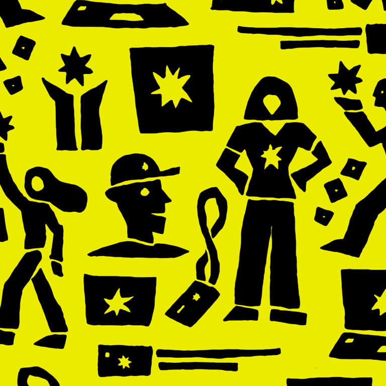
Artwork by Leslie Olson