Rebranding the Emily Program Foundation
WithAll (formerly The Emily Program Foundation) is a non-profit focused on empowering eating disorder prevention and strengthening support for recovery.
When The Emily Program Foundation approached us about renaming and rebranding their foundation, we could not have been more thrilled. At Superhuman, we try to take on a few non-profit projects each year. We were especially passionate about this project, as many of us have a strong interest in body positivity, inclusivity and intuitive eating. Additionally, many of us have been directly affected by eating disorders, whether personally or through someone we love. We couldn’t think of a better fit.
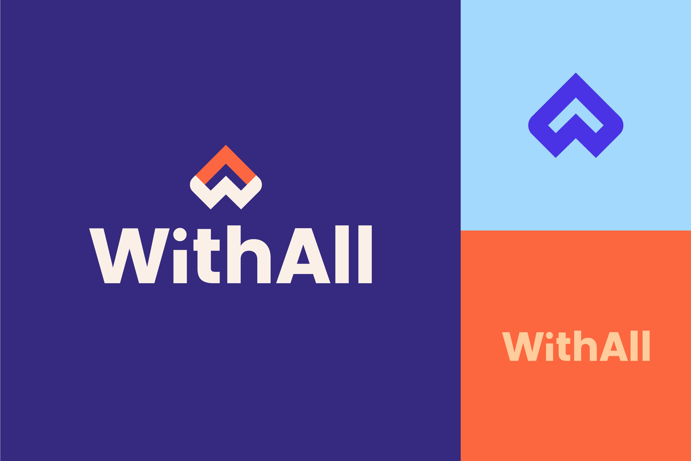
The Emily Program Foundation wanted their identity to represent inclusivity, respect, understanding and prevention. We wanted to create a name that felt ownable but familiar and approachable. We ultimately landed on the name WithAll, a play on “wherewithal” that highlights ability, inclusion and a network of encouragement. The W and A are also a nod to Anna Westin, the inspiration behind the foundation.
For the logo and typeface selection, we wanted to escape the clichés of the category that not only feel dated, but also potentially push people away from seeking more information. The category has many script fonts, which tend to feel sentimental or memorial-focused. We wanted a bold, geometric sans serif that feels modern and approachable to everyone.

For the logomark, we wanted a symbol that felt different than the category, which was full of swoops, hands and vague geometric shapes. Ideally, it would be full of meaning and forward-focused. To do this, we combined the W and the A to create an abstracted heart. The negative space also creates an upward arrow to show optimism and a positive view of what’s to come. The ups and downs of the mark also nod to the complicated journey of experiencing an eating disorder, or supporting someone going through one.
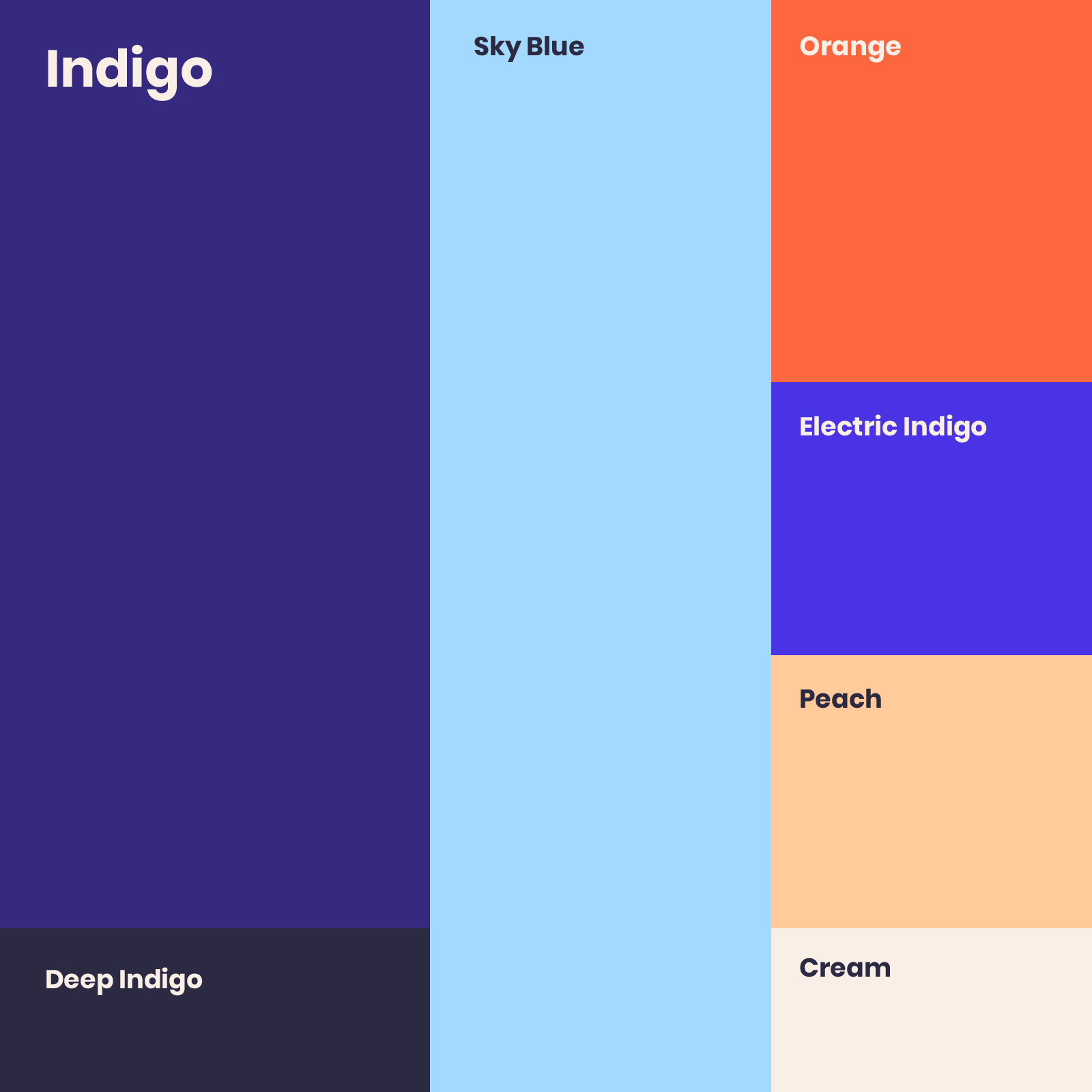
Lastly, for the color palette, we wanted to focus on a rich indigo (the color of intuition) as well as a warm, vibrant orange that nods to The Emily Program Foundation. For accent colors, we utilized a soft sky blue, a vibrant indigo and a soft peach. We also prescribed the use of cream instead of pure white, and deep indigo instead of pure black, to bring warmth and depth to the palette. We wanted the palette to feel vibrant and unique, without being too eccentric or constrictive.
We’ve loved working with the WithAll team and hope their new name and identity allow them to reach even more people with their important message.