Artera
Getting to the heart of healthcare technology.
Context
Artera first came to Superhuman as WELL Health, a health-tech company that needed to carve out a distinct brand identity in a crowded category. While the team was aligned on needing a new name and brand, they didn't want to part ways with the heart motif and its significance to the company.
Challenge
How can we turn a common symbol into the cornerstone of a differentiated brand?
Connection
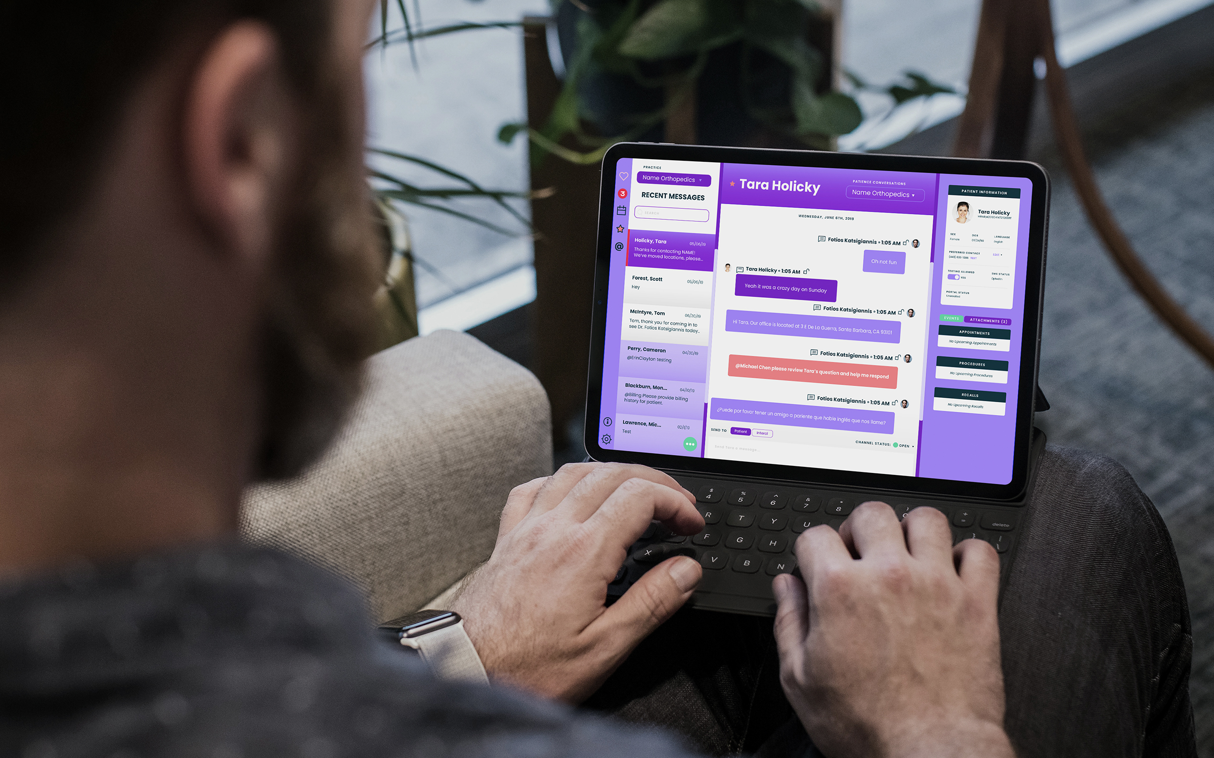
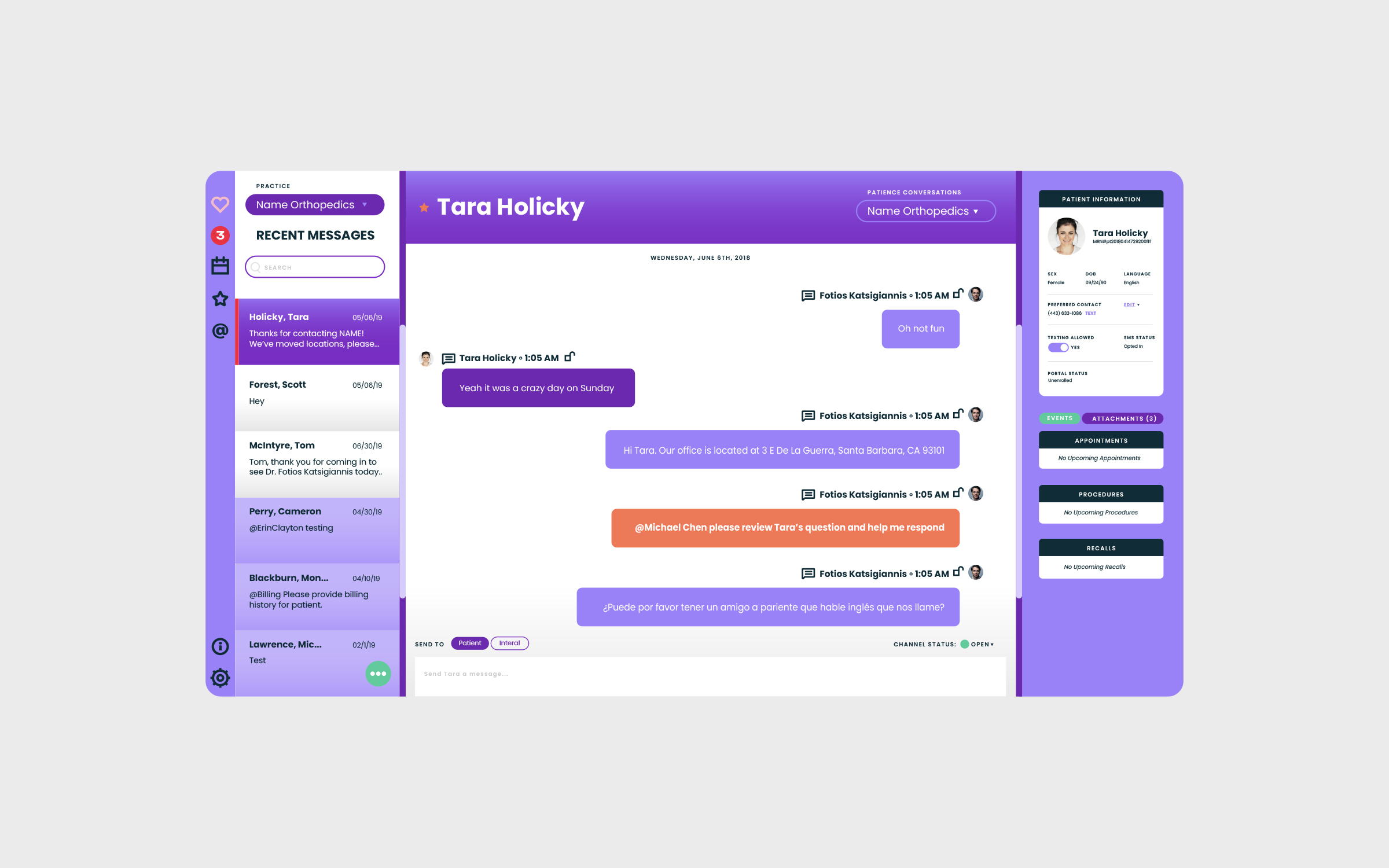
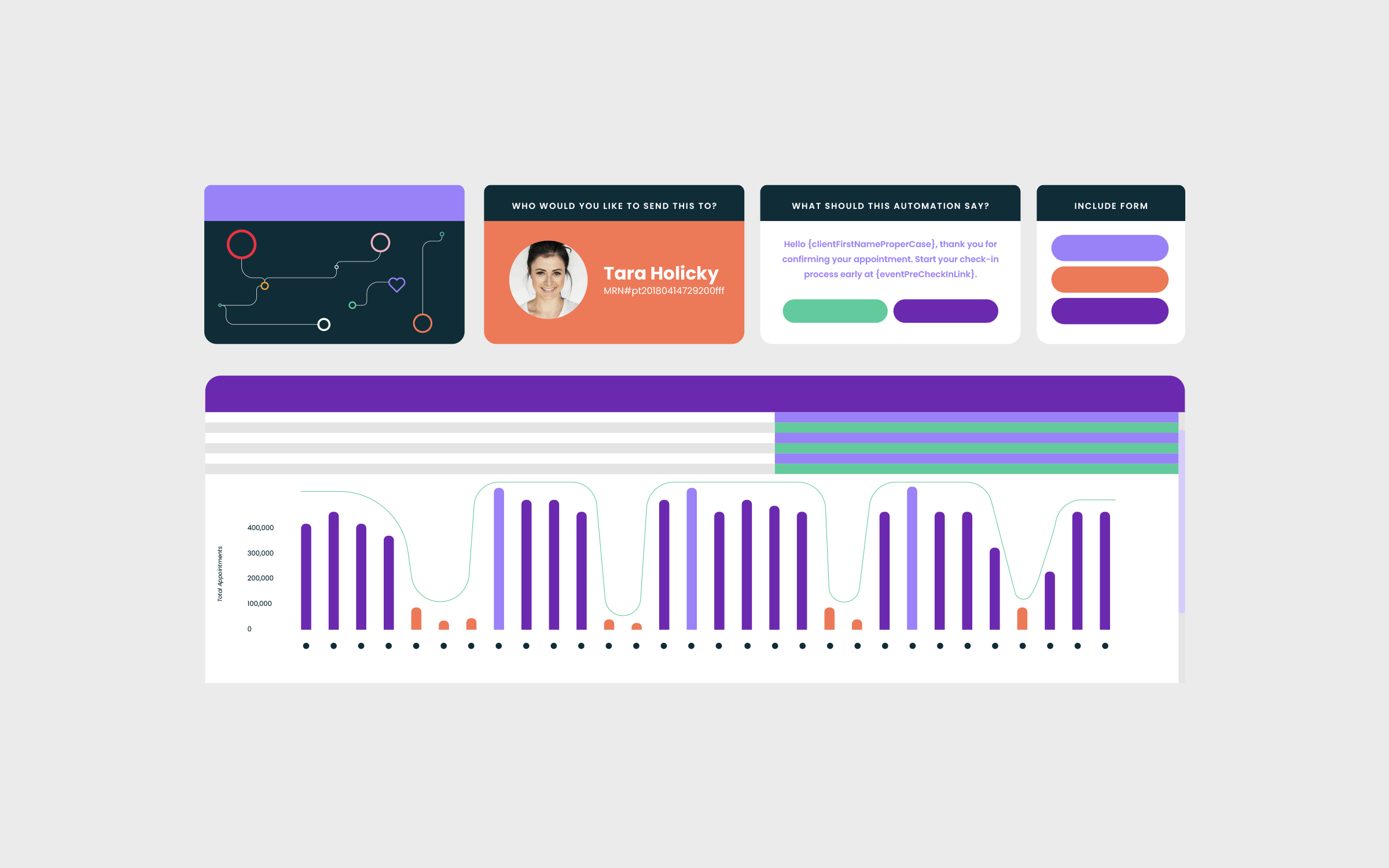
A core brand strategy insight inspired a new purpose for WELL Health’s cherished heart motif and connected the dots across all of the brand work. Much like a heart, WELL Health acts as the central hub of communication within the complex healthcare system. We applied the heart metaphor to the naming process, landing on Artera as a reference to the cardiovascular system that carries blood from the heart throughout the body. To drive the brand home, we also layered the metaphor into the product, messaging, tagline, and visual identity.
Finding a way to keep WELL’s memorable heart element as a part of Artera’s new brand was an ambitious design challenge. Having the heart double as the new wordmark’s first “a” letterform results in a strong brand mnemonic.


[Artera’s new name allows us to build] a long-term company with no intention of flipping or selling.
—Guillaume de Zeirek, CEO, Artera
[We] truly enjoyed every part of the process and every member of the team we were able to work with.
—Eric Fairbanks, Sr. Director of Brand Marketing, Artera