Livio Health
Putting more care in the end-of-life care experience.
Context
As Livio’s offerings expanded, they needed a new brand story that could tell the world about the traditional healthcare services they offer in non-traditional settings.
Challenge
How can we avoid the sterile semiotics of the healthcare world?
Connection
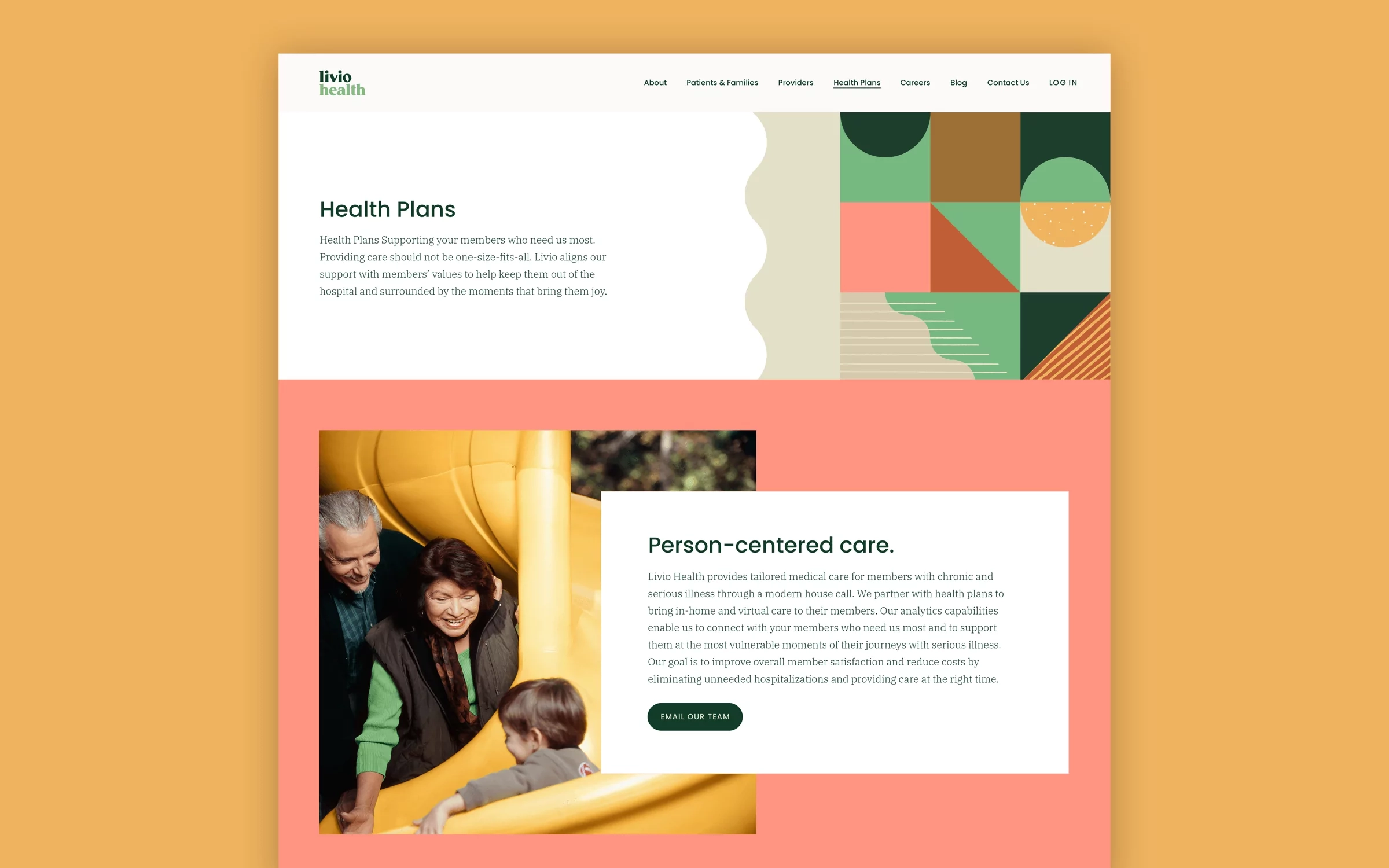
We helped articulate Livio as a brand that focuses on the richness of their patients’ lives, not their illness. Together, we created a refreshed brand that’s energetic, compassionate and unlike any other in the industry.
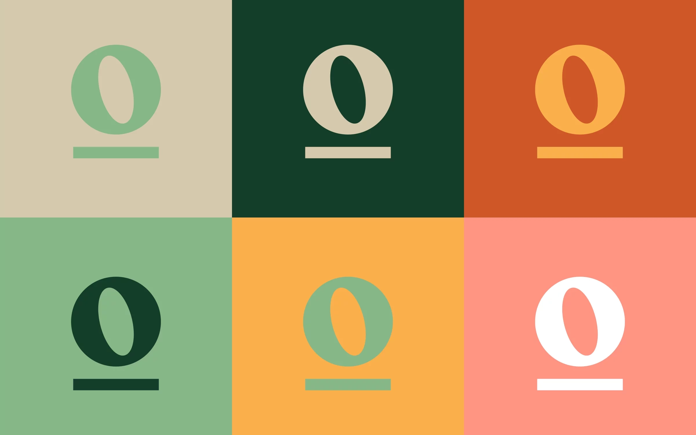
The Livio Health logo was created to feel bold but warm. Serifs on the letters create a strong base, stabilizing the angular letters within the name. The roundness of the letterforms adds a human element. The angles of the letters point upward to suggest optimism and progress.
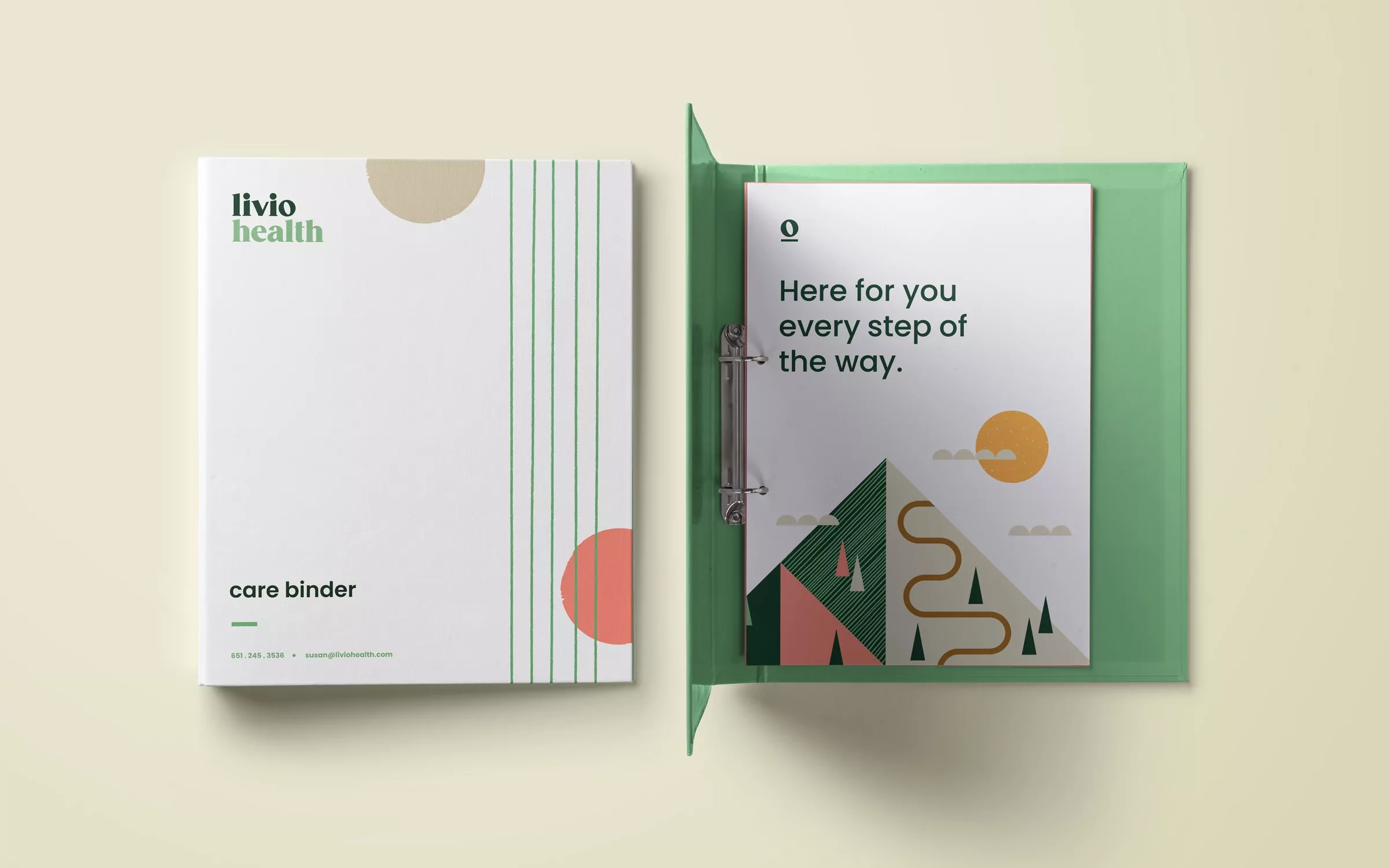
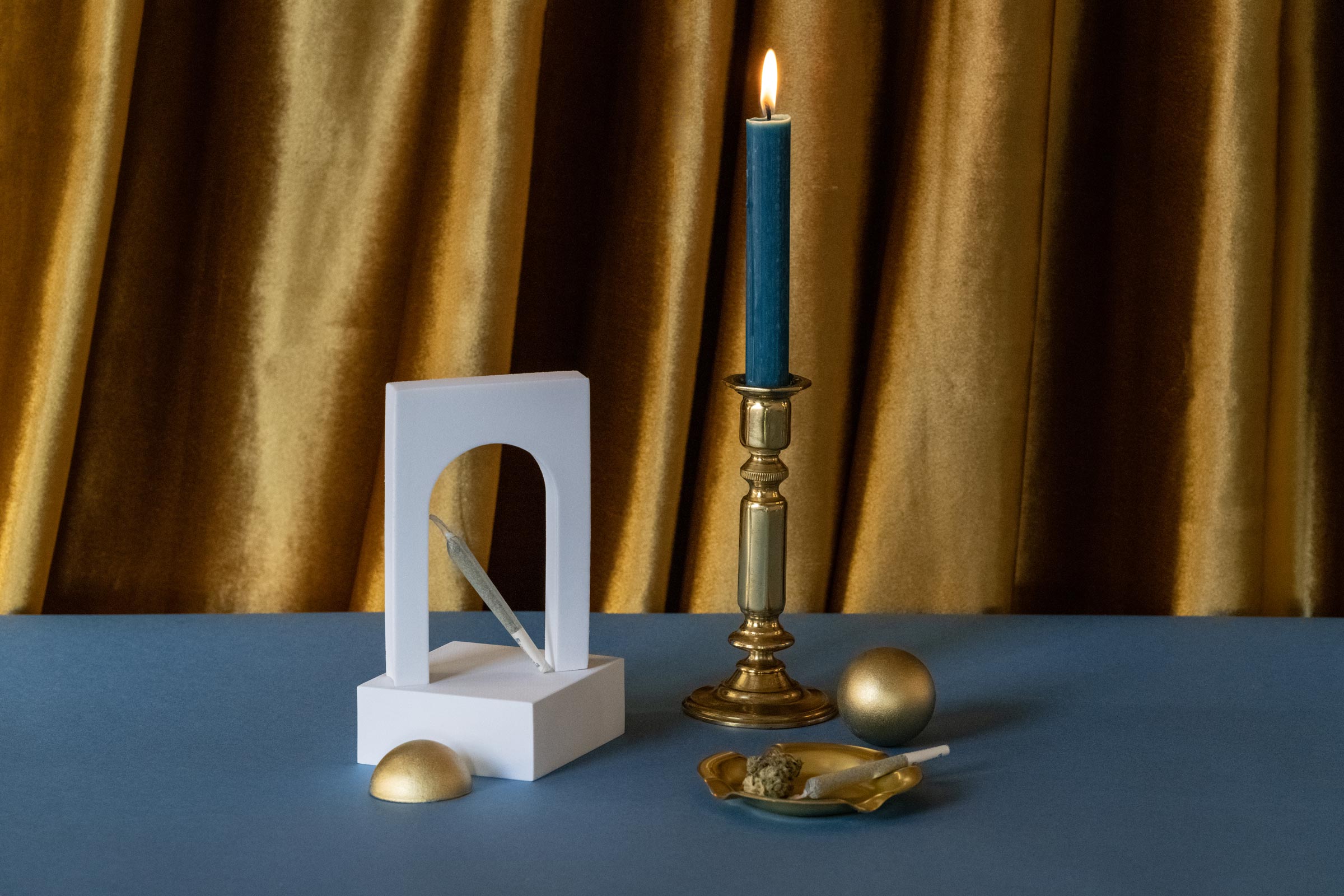
Bold geometric patterns allow for integration of content-related iconography throughout the brand. Additional organic texture elements lend warmth and approachability to the creative style.
Acquired by Lifespark in 2022
Who were “inspired by Livio Health’s ability to shift health care around the person and produce impressive outcomes.”

“The whole team was extremely flexible…the creative output was next-level gorgeous, and really makes us stand out proud in our category.”
—Lizz Wright,
Service Design Strategist, Livio